
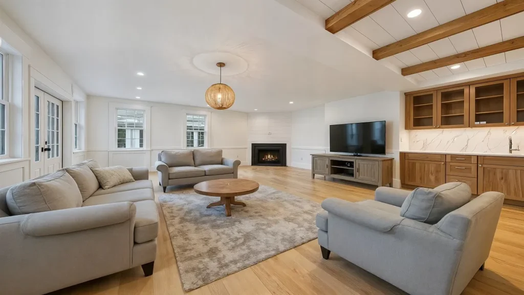
After photographing more than 10,000 homes over 14 years, I’ve learned that the fastest photographers are not necessarily the ones moving their cameras the most.
They are the ones who recognize the right composition quickly.
One of the simplest composition guidelines I use is the two-wall rule. It gives you a reliable starting point for photographing living rooms, bedrooms, kitchens, offices, and many other interior spaces.
The rule is simple:
Whenever possible, compose the photo so the viewer can see two walls, the floor, and the main features of the room.
This is not a law. Some rooms need a centered, one-wall composition. Large open-concept spaces may benefit from showing three walls. But for standard listing photography, the two-wall rule helps you create depth, show useful information, and avoid wasting time searching for random angles.
Table of Contents
- What Is the Two-Wall Rule?
- Why Two Walls Make a Room Feel Larger
- How to Place Your Camera
- Choosing the Right Height and Lens
- Room-by-Room Examples
- Common Two-Wall Mistakes
- How This Rule Speeds Up Your Shoot
- FAQ
What Is the Two-Wall Rule?
The two-wall rule means positioning your camera near a corner or doorway and aiming diagonally into the room.
Your frame should normally include:
- Two adjacent walls
- A visible section of floor
- The room’s primary feature or purpose
- Enough ceiling to show the room’s proportions
- Straight vertical lines
The goal is to give the viewer a clear understanding of the space without making the room look distorted or cramped.
A common mistake is pointing the camera straight down the length of a room and trying to include three walls. This can create a tunnel-like composition. The room may be physically spacious, but the photograph makes it feel long and narrow.
Showing two walls usually creates a more natural sense of depth because the viewer can understand the corner, the distance to the opposite side, and how the main furniture or architectural features relate to one another.
The complete real estate photography shot list can help you combine this composition guideline with a consistent room-by-room shooting order.
Why Two Walls Make a Room Feel Larger
A photograph is a flat surface, so you need visual information that communicates three-dimensional space.
Two walls meeting at a corner provide that information. The lines of the walls, floor, ceiling, cabinetry, and furniture all lead the eye into the frame. This creates depth without requiring an extremely wide lens.
Showing two walls also gives the room a visual boundary without closing it in completely.
When you photograph three walls from a very wide position, the edges of the frame can become visually busy. Doorways, partial walls, and furniture may be cut off or stretched. The viewer sees more surfaces, but may understand the room less clearly.
The two-wall composition is often a better balance:
- It shows how the room is shaped.
- It creates a sense of depth.
- It keeps the main subject easy to identify.
- It reduces the temptation to use excessive ultra-wide distortion.
- It makes the image easier to edit naturally.
This is especially important for listing photography. The goal is not to prove that you used the widest lens possible. The goal is to show the property accurately and attractively.
How to Place Your Camera
When I enter a room, I do not immediately set up the tripod. I first walk around the space and look for the angle that communicates the room best.
Use this process.
1. Identify the room’s main feature
Ask yourself what a buyer needs to see.
In a living room, it may be the fireplace, window wall, or seating area. In a kitchen, it may be the island, cabinetry, or connection to the dining space. In a bedroom, it may be the bed, windows, and closet access.
The strongest corner is usually the one that shows the room’s purpose most clearly.
2. Start near a corner or doorway
Place the camera near the corner that gives you the best view of the room. You do not always need to put the tripod directly against the wall. A small adjustment forward or sideways may produce a much cleaner composition.
Doorways can also be useful camera positions, especially in small rooms. They let you include more of the space while maintaining a two-wall perspective.
3. Aim diagonally
Turn the camera so the two walls carry reasonably balanced visual weight.
They do not need to be perfectly equal. If the kitchen island is the main feature, you may allow more of one wall to appear. But avoid allowing one wall to dominate unless you are intentionally creating a one-wall composition.
4. Include the floor
The floor is one of your most important depth cues.
If you crop out too much of it, the room may feel flat. If you include too much, the photo may feel low or unbalanced. Start with enough floor to show the distance between the camera and the main furniture, then adjust based on the room.
5. Keep the camera level
Use your camera grid, electronic level, or tripod adjustments to keep the camera level. Avoid tilting up or down to force the composition into place.
If you need more floor or ceiling, raise or lower the tripod. Tilting the camera can cause vertical lines to converge, making walls and doorframes appear to lean.

Choosing the Right Height and Lens
For most living rooms, bedrooms, dining rooms, and offices, chest height is a dependable starting point. In practical terms, that is often somewhere around four to four-and-a-half feet, depending on the room and your own height.
The correct height is not a fixed number. It depends on what you need to show.
Living rooms and bedrooms
Use a moderate height that includes the furniture, enough floor, and the relationship between the walls and windows.
If you raise the camera too high, the floor can disappear behind furniture. If you lower it too far, furniture may dominate the frame and the room can feel compressed.
Kitchens and bathrooms
A slightly higher camera position can help show countertops, sinks, islands, and other horizontal surfaces.
Do not raise the camera simply because the room is small. Raise it because the higher viewpoint communicates the features more effectively.
Lens choice
A wide-angle zoom gives you flexibility, but wider is not automatically better.
For full-frame cameras, a lens in the general 14–24mm or 16–35mm range is commonly useful for interiors. On a Sony system, the Sony FE 16–35mm f/2.8 GM II provides useful flexibility when you need to move between moderate and wider compositions. Nikon Z photographers may consider the Nikon Z 14–30mm f/4 S.
Use the longest focal length that allows you to show the room properly from a sensible camera position. This usually produces a more natural result than immediately zooming to the widest setting.
A wide lens should help you solve a space problem, not hide poor camera placement.
Room-by-Room Examples
Living rooms
Start from a corner or doorway that shows the seating arrangement and the main architectural feature.
Try to include:
- Two walls
- The floor beneath the seating area
- Windows or a fireplace
- The connection to adjacent spaces when useful
If the living room opens into a kitchen or dining area, take one two-wall composition that explains the living room and a second image that communicates the overall flow.
Bedrooms
The bed is usually the anchor.
Place the camera where you can show the bed, two walls, windows, and useful circulation space. Avoid standing so close to the bed that it becomes oversized in the foreground.
If the bedroom is narrow, use the doorway if necessary. Do not force a corner composition that hides the room’s actual layout.
Kitchens
In kitchens, the island and countertop surfaces often matter more than showing the exact corner.
Raise the camera slightly if needed, keep the camera level, and use the two-wall rule as a starting point. Make sure the image shows how the kitchen connects to the surrounding living or dining space.
Bathrooms
Bathrooms are often too small for a perfect two-wall composition.
Use the widest practical angle, but watch the edges carefully. Keep toilets, vanities, tubs, and showers from becoming awkwardly distorted. A doorway position may give you a more accurate result than standing inside the tightest corner.
Offices and bonus rooms
Look for the angle that shows the room’s function. Include the desk or built-in feature while preserving enough floor and wall context to make the space understandable.
Open-concept rooms
This is where you may intentionally break the rule.
A three-wall or wider composition can be useful when the primary purpose is to show how the kitchen, dining room, and living room connect. In these cases, the goal is not to make each individual room look larger. It is to communicate the overall layout.
Common Two-Wall Mistakes
Showing a third wall accidentally
A small sliver of a third wall at the edge can make the frame feel closed in. Check both sides of the image before pressing the shutter.
Using the widest focal length immediately
Ultra-wide focal lengths can exaggerate foreground furniture and stretch the edges of the room. Step back, adjust your camera position, and test a slightly longer focal length first.
Tilting the camera
Tilted cameras create leaning verticals. Change tripod height instead.
Putting the camera too high
If you can see over every piece of furniture, the camera may be too high. Lower it until the room feels connected rather than viewed from above.
Cropping important features
Do not cut off half of a window, island, fireplace, or major furniture piece unless the crop is deliberate. Move the camera a few inches before changing to a much wider lens.
Ignoring the room’s purpose
A technically correct two-wall photo can still be a weak listing image if it does not show why the room matters.
How This Rule Speeds Up Your Shoot
The biggest benefit of the two-wall rule is not just better composition. It is decision-making speed.
Without a framework, you may spend several minutes walking around every room, testing angles, and reviewing the back of the camera. Across an entire house, that time adds up.
With the rule, you can use a repeatable process:
- Identify the room’s main feature.
- Find the strongest corner or doorway.
- Set the camera around chest height.
- Aim diagonally to show two walls and the floor.
- Level the camera.
- Check the edges and capture the image.
- Move on unless the room requires a second angle.
This approach supports the larger workflow described in the 60-minute real estate photography workflow.
You are not trying to make every room look identical. You are creating a dependable starting point that reduces hesitation and keeps your coverage consistent.

That consistency also helps during editing. When your camera is level, your compositions are intentional, and your exposures are captured systematically, you spend less time correcting avoidable problems later. For the complete capture-to-delivery process, see the HDR real estate photography guide.
FAQ
Is the two-wall rule mandatory for every real estate photo?
No. It is a practical starting point, not a strict requirement. Use it for most standard interior compositions, but break it when a centered view, one-wall image, or three-wall layout communicates the property better.
Should the two walls appear in equal amounts?
Not necessarily. Balanced walls often create a natural composition, but the room’s main feature should guide your framing. One wall may need more space if it contains the fireplace, kitchen, or primary window.
What camera height works best?
Chest height is a reliable starting point for most rooms. Kitchens and bathrooms may benefit from a slightly higher position so countertops and fixtures are easier to see.
Should I always shoot from a corner?
No. Doorways can be excellent positions, especially in small bedrooms, bathrooms, and offices. Choose the position that communicates the room accurately.
What focal length should I use?
Use the longest focal length that allows you to show the room properly from a sensible position. A flexible wide zoom, such as a 16–35mm or 14–30mm, can be useful, but do not default to the widest setting.
Why does my room look smaller when I show three walls?
Three-wall compositions can create a tunnel effect, especially when they require an extremely wide lens. The extra wall may add information while making the room feel visually enclosed.
Should I include the ceiling?
Include enough ceiling to show the room’s proportions, but do not let it dominate the frame. Adjust the tripod height rather than tilting the camera.
Does the two-wall rule apply to exterior photography?
Not in the same direct way. The idea is most useful for interior composition, where corners, floors, and walls help communicate depth.
How many photos should I take in each room?
That depends on the room, the property, and the client’s coverage requirements. Start with one strong composition, then add another angle only when it communicates information the first image does not.
Can this rule help me photograph homes faster?
Yes. It gives you a repeatable decision-making process. It will not eliminate every difficult room, but it can reduce hesitation and help you move through standard spaces more consistently.
Final Thoughts
The two-wall rule is simple, but it solves several common problems at once.
It helps you:
- Create depth
- Show the room’s layout
- Avoid unnecessary distortion
- Keep vertical lines controlled
- Choose camera positions faster
- Produce more consistent listing coverage
After 14 years and more than 10,000 homes, I still rely on simple systems like this because they work under real shoot-day conditions.
The best composition rule is the one that helps you make a good decision quickly, deliver better images, and move on to the next room without sacrificing quality.
For more practical systems, visit the RE Media Systems Shoot Faster category, explore the Recommended Gear, and continue building a workflow that helps you shoot faster, earn more, and create a more sustainable real estate media business.
CubiCasa pricing reminder: If you use CubiCasa for floor plans, verify the current pricing and plan details directly with CubiCasa before building it into your packages or workflow. Include premium floor plans in every listing where they fit the client’s service package, but price your services based on the value and deliverables you provide, not simply on your production cost.
What to Do Next
On your next property, apply the two-wall rule in every standard room:
- Find the main feature.
- Choose the strongest corner or doorway.
- Set the camera around chest height.
- Show two walls and the floor.
- Keep the camera level.
- Capture the image and keep moving.
Small decisions repeated consistently are what turn a collection of individual shoots into a professional system.
{
  "@context": "https://schema.org",
  "@type": "Article",
  "headline": "The Two-Wall Rule: How to Frame Rooms Faster",
  "description": "Learn Scott Prokop’s two-wall rule for real estate photography, including camera placement, height, lens choice, room examples, common mistakes, and faster shooting workflows.",
  "author": {
    "@type": "Person",
    "name": "Scott Prokop"
  },
  "publisher": {
    "@type": "Organization",
    "name": "RE Media Systems",
    "url": "https://remediasystems.com"
  },
  "mainEntityOfPage": {
    "@type": "WebPage",
    "@id": "https://remediasystems.com/two-wall-rule-real-estate-photography/"
  },
  "articleSection": "Shoot Faster",
  "keywords": [
    "two-wall rule real estate photography",
    "real estate photography composition",
    "how to frame a room",
    "camera placement for interiors",
    "real estate photography room angles"
  ],
  "about": {
    "@type": "Thing",
    "name": "Real estate photography composition"
  }
}
``